


Website Redesign
How might we make the buying process quick and intuitive?
Long story short:
This was a 10 week-long project where we rearchitected the Dutch Store website. The team consisted of an other UX student and myself. This case study focuses on the heuristic evaluation of the site and solving these problems in our final design. The design didn’t need to be interactive and we only designed the home page, product overview page, product in detail and the check-out process.

My notes and reflections will go here.
The problem
The current website is not built according to the target audience's needs and has several issues with both design and setup which indicates a strong need for a redesign. As per now there are no options for customizing output and a lack of consistent and coherent design which negatively affects the user experience. The target group, Dutch people who live in the US, are in need of a more personal experience with using the product, which is not provided. The website does not appear as efficient nor modern or up to date to the user.


Heuristic evaluation
We made an extensive expert review of the website using the following 10 design principles:
Principle #1 - Simple and natural dialogue
Principle #2 - Match the system with the real world
Principle #3 - Make things efficient
Principle #5 - Provide feedback
Principle #7 - Make things predictable
Principle #8 - Visual hierachy
Principle #9 - Offer help
Principle #10 - Make it engaging
Key insights
After performing an extensive review of the website and persona, we came to some conclusions that will help us in the process of the redesign. The user needs a platform where she easily can buy different Dutch food and help her kids come into contact with the Dutch culture. The website does not provide an organized and up to date design, which makes it hard to navigate. Familiar patterns such as footer and icons are not present. There is no option for filtering products or searches, which makes it less efficient for the user. Use of colors, buttons (shape and quantity) and general layout is not consistent.
These principles really helped me understand the usability problems.
This was my first project focused on interaction design. I loved analysing the website and creating a new style guide.
After finishing the table I was really excited to start the style tile.
Requirements
We prioritized the requirements with the MoSCoW method. This method is really helpful when you are stuck. It’s a prioritization technique which is easy to learn and apply. It was a great way for us to decide what’s really valuable for our project.
This is the table that we created to form and prioritize the requirements.
The current website is very overwhelming and cluttered as you can see here. 😵💫


Style Tile
We want to create a design that really fits with the users. Most users are Dutch parents living in the US who want to share their culture with their kids. We believe that the design doesn’t need to overwhelm the user with Dutch elements everywhere. It doesn’t need a Dutch flag, blue or orange colors. It’s much more interesting if there are slight hints such as photos of Dutch food and reviews by other Dutch families. In addition to this, too much “noise” and advanced design automatically requires more of the user, and in this case the users are not in need of this.
We want to keep the design simple and clean. For the logo we choose a font which has a strong contrast in it. The letters itself are very clean (sans serif) but the black outlining with the whitespace makes it a little more dynamic and playful. We think this really fits the identity of The Dutch Store.

We choose a natural color scheme with warm colors (beige) because we think those colors feel really inviting. This also fits really well with a variety of product colors. We also want to include photos of typical Dutch food and a photo of a Dutch family. Both the color scheme and the photos really fit with our design vision because we want the users to feel welcome and we want them to feel like there is another human at the other end. In addition to this, using a few selections of colors contribute to a calmer interface, where the products become more visible to the user.
The icons that we are going to use are simple stylized shapes in grey. We decided to keep the Facebook icon blue, because this will be easier for the user to recognize (familiar pattern).
All the typefaces are Helvetica (capital/bold/light). We wanted to keep it simple because there are enough other distracting elements on the page.
Overall, the interactive elements have a rounded style. This gives the interface a softer appearance. We also want to use lines to divide elements and an arrow to indicate a “back” button or to indicate a drop-down chooser. We designed the three circles next to each other to navigate a carousel. And the 2 circles with a line in between can be used to indicate a price or state. We decided to use a column grid because this can be easily adapted to view the website on a phone (and different screen sizes).
First we made some sketches and then we started creating the wireframes. We put a lot of effort into applying the design patterns.
The website also offers recipes ideas which make it look inviting. 👩🍳
Wireframes

After making a style tile we used the book Designing Interfaces - Patterns for effective Interaction Design by Jenifer Tidwell to choose fitting patterns for our design. In our report we also argue why we wanted to use these patterns.
Take a look here.


Annotated Visual Design
We annotated our design to make sure we met all the criteria. Here are some examples of the design patterns that we included.

Clear entry point - A big header with clear text and an opportunity for a convention right off the bat gives the user a clear entry of their website.

Prominent done button or assumed next step – Active when clicked, goes to the next page.
Sitemap footer - Footer with sitemap of important pages and information. Pages that contain subpages has their own columns, contact info to the right. Shows on all pages.

Button groups - Active when clicked on desired options. Filters active when clicked on “view”.

The annotations made me more conscious about our design choices.
Error messaging - Shows active state if text fields does not add up according to user’s input.
Good defaults and smart prefil - Shows active state when arrow is clicked.
I tried to keep the design minimalistic and easy to understand.

The website has a more personal feel. The user can relate to the family in the customer review. This builds trusts and encourages them to buy the products and try the recipes.
I realized that including feedback in the design is easy to forget. You really have to think about the whole flow. It is an essential part of the design.
Final Visual Design
This is the home page and I will also show you some details of the design.


Home page - fat menu
Product overview page

Product overview - hover button

Product overview - filter

Product overview - sort by

Product detail page

Check out - cart

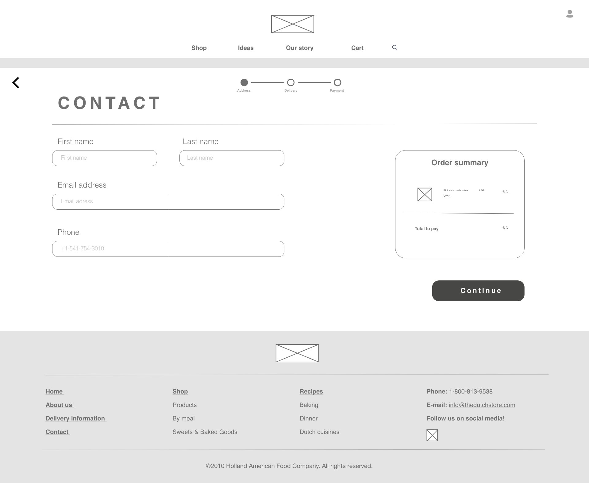
Check out - contact form

Loading screen

Check out - address

Check out - address error

Check out - validation
Check out - delivery


Check out - payment

Results and takeaways
After completing our design, there were some requirements that either didn’t fit properly to our design choices or were not relevant enough. As we used the MoSCoW model to rate the requirements from low to high priority, we could already predict which ones we might not be using for our design.
For example, we didn’t add the fresh food section, because we found out it’s not feasible for the company. We also didn’t include the customization options on the website because it would have been very complicated and demanding to design and develop.
When we reflected on our design, we realized we didn’t have to include both the fat menu and site map footer since both have the same functionalities.
Improvements for the next version:
- More attention on feedback to the users.
- Take a look at the grids and see if it could be displayed in a more engaging way.
Either use the fat menu or site map footer (not both).
Make the website more engaging by adding more interactive functionalities and smooth animations.
The next step would be testing the design. Since this was a shorter project with a deeper focus on heuristic evaluation, testing wasn’t part of the assignment.