


Navigating Change: A Redesign of Online Government Magazines
How might we improve the online magazine's navigation to help readers easily browse content while keeping visual storytelling impactful?
Long story short:
Dienst Publiek en Communicatie (agency of the ministry of general affairs) is redesigning their online magazines. There are approximately 60 online magazines across various organizations. Research revealed significant flaws in navigation, particularly in the user flow between the government websites and the magazines. The primary objective was to update the navigation and enhance the look and feel of the magazines. One of the key challenges was catering to diverse user preferences, balancing the need for rich visual content with concise information delivery and overview.
As a UX designer, I was instrumental in preparing prototypes in Adobe XD for usability testing. Following the usability tests, I analyzed the results and iteratively worked on the designs. Additionally, I played a role in facilitating a stakeholder workshop. I prepared and presented designs for stakeholder workshops to gather valuable feedback and insights. During the project, I collaborated with various stakeholders and an agile team.
The redesigned magazine pages in Adobe XD demonstrated improvements in navigation and user experience. Incorporating feedback from usability tests and stakeholder workshops, the design effectively balanced varying user preferences. As a result, the design is going to be implemented. With the development team prepared to start, the aim is to create a more user-friendly and visually appealing online magazine experience catering to diverse user groups.

The problem
The redesign focuses on resolving major navigation challenges, especially the user flow between main government websites like defensie.nl and its associated magazines. Currently, when users open a magazine on defensie.nl, it opens directly with no straightforward way to return to the main site, leaving the browser's back button as the only option. Finding a solution to this issue is essential. Additionally, the redesign aims to enhance the overall look and feel of the magazines, while also addressing the challenge of balancing rich visual content with the need to deliver concise information to cater to diverse user preferences.
My notes and reflections will go here.


I learned the importance of designing with diverse user behaviors in mind—some prioritize visuals, others value straightforward information.
Usability test
As a usability test was approaching, I became involved. I rapidly created a first prototype in Figma. Two weeks later the tests were conducted. I observed and collected data and translated the data into insights.

The usability test, conducted by the research team at Algemene Zaken, had a two-room setup: one for the participant and interviewer, and another for observers like myself. Finding suitable participants proved challenging, as many had no prior experience with the Defensiekrant.
Key Insights
Users want to immediately see an overview of what is available. The challenge is to find a balance between the two.
Users also reported that a article title doesn't convey much. Users want two sentences of text as an introduction.
Icons like “alle nummers” are unclear and need better labeling.
Users are confused by terms such as magazine, newspaper, edition, issues because they have different meanings but some terms are still used interchangeably.
The word “uitgaven” in the breadcrumb is unclear to some users. The placement of the magazines within the site is a point that needs to be discussed.

Brainstorming solutions
How might we create a balance between rich visual content and concise information?

After several brainstorming sessions, the idea emerged to create a spectrum ranging from a lot of context to minimal context.
How might we create a different look & feel between website and magazine?

Brainstorming solutions to a new look and feel that differentiates itself from government websites while still feeling coherent.
How might we create hierarchy within the articles?

Website VS Magazine
It's crucial that the magazines don't resemble a formal government website; they should convey a distinct storytelling experience. To achieve this, the magazines require a different look and feel. We've explored where this magazine style should start and considered various options for where to make this distinction. We carefully weighed the pros and cons of each approach to determine the best point of separation.

Second prototype


Stakeholder Session
During the stakeholder session, we met with editors from several magazines, including representatives from Defensie and Rijkswaterstaat. Our team introduced the new design, walking through the changes we made and explaining the reasons behind each one. We then conducted a dot voting exercise, where different options for the navigation and article pages were displayed on the wall, and everyone voted on their favorites. After the voting, we facilitated a discussion where participants explained their choices and discussed any elements they felt were still missing.

Design Critique with UX Designers
To gain additional perspectives on the design, I consulted my UX design colleagues at Capgemini for feedback. Overall, they found the navigation to be well-structured and intuitive. However, they suggested revisiting the use of colors in the design. Currently, each government agency uses its own communication color, but some of these colors are quite intense. For example, bright yellow is used by some agencies as a communication color, which can be overly distracting and pull attention away from the page’s content. To address this, they recommended using less intense shades to create a more balanced and user-friendly design.

Iteration
An iterated version of the most selected table of contents from the stakeholder session.

A revised iteration of the headers most frequently chosen in the stakeholder session.

The stakeholders also requested a header with text placed above the photos.

Changes to the navigation
One of the major issues identified during the usability test was that users struggled to find a way to exit the magazine. In the previous design, the option to leave the magazine was only available on the "alle nummers" page. To enhance navigation, we decided to make this button accessible on every page, allowing users to easily exit the magazine at any time. However, a challenge arises because the destination this button leads to varies with each magazine. Ideally, we would like to inform the user that, for example, it redirects to defensie.nl. Unfortunately, due to the multiple possible destinations—some magazines don’t even have a government website—this isn't technically feasible. As a result, the button is simply labeled "sluit magazine" (close magazine).
Additionally, because we're adding an extra button to the navigation bar, we need to move the magazine title beneath the bar, placing it above the content. This change is necessary because, on mobile devices, the navigation bar doesn't have enough space to accommodate the title.


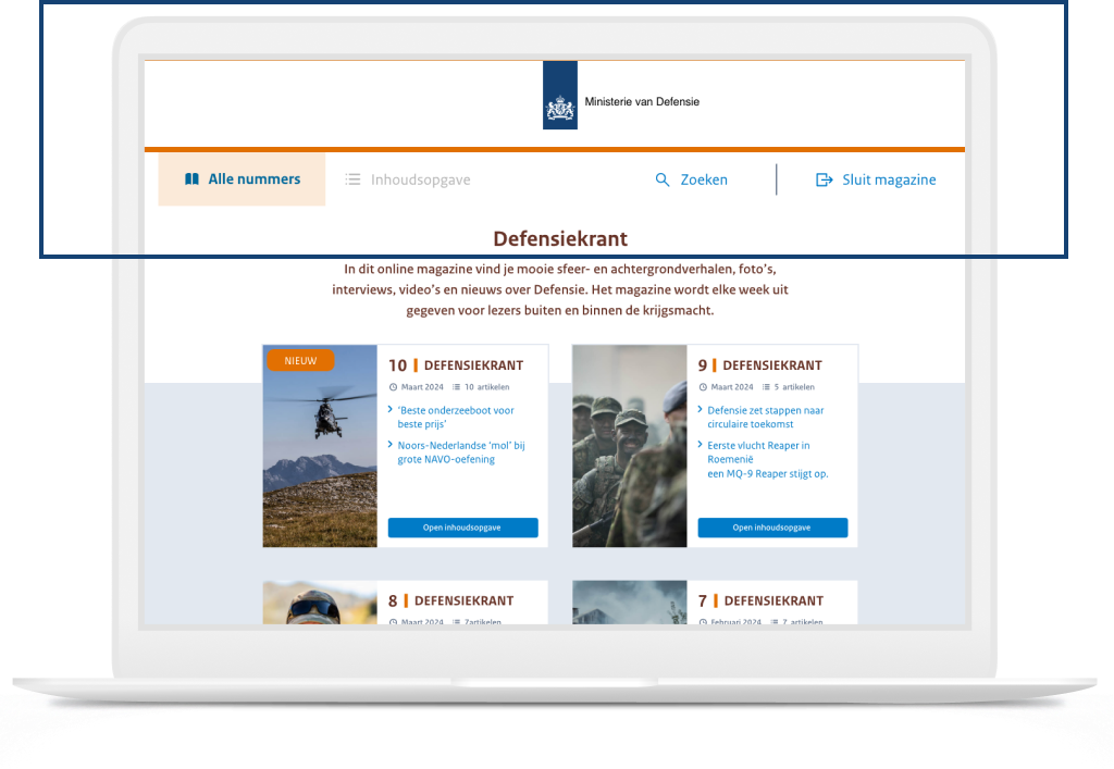
Number overview and it’s challenges
From the beginning of this project, I created numerous designs for the number overview page. It evolved from displaying a lot of information in a cluttered format to a more structured and simplified layout. The challenge with designing this page is that each magazine has its own unique approach. For example, some magazines use complete sentences as titles, while others only use numbers, and some don’t use numbers at all. Additionally, there are yearly magazines and special issues.

The importance of the issue number varies; for some magazines, it is crucial, while others do not emphasize it. This raises several questions: How do you organize the information effectively? If a magazine doesn’t use a number, will it create a noticeable gap? If all the information is presented in the same font size, how can we distinguish what is more important without creating chaos?
Search page
During the project, I also went through multiple iterations for the search page. The usability test revealed that readers have varying preferences for their search criteria; some want to look for specific numbers of the defensiekrant, articles, or even numbers from other magazines.
It became clear that using the search page from the Rijkshuistijl was the most technically feasible option. One key improvement was to make the design more visual by incorporating photos. Additionally, I adjusted the filter options to allow readers to select which magazines they would like to search in.

Prototype Walkthrough
Second Usability Test
The usability test, conducted by an external agency for objectivity, provided positive feedback and useful recommendations. Observing participants, we began implementing improvements even before receiving the results. Many issues identified were already on our radar, but some couldn’t be fully resolved due to technical constraints.
For example, the agency noted:
"Users see the magazine and website as cohesive but find navigating between them confusing. New readers rated the redesign highly (score: 86, A rating) but suggested clarifying actions like 'close magazine' and improving page guidance."
This issue, while known, remains unresolved due to varying destinations for different magazines, making a universal button impractical. Another area needing improvement is the search page, which was developed quickly and requires further refinement.
Giving the reader more context
One of the main takeaways from the test was that new readers require more context. New readers often had questions such as who the magazine is intended for and when the magazines are published. The next step was to investigate how much context is necessary for users. To address this, I created a spectrum ranging from a lot of context to minimal context, allowing us to explore and identify the right balance for providing information to users.
Improving search page
We refined the search page based on the insights gained from the usability test. However, we faced several limitations, and many of my ideas would require significant time and effort to implement. Therefore, it is essential to find a middle ground that balances user needs with practical constraints.

On the right you can find some examples of iterations of the search page.
Final design
Navigation Bar
The navigation bar is designed to be simple, featuring only four buttons.
The table of contents button is greyed out. While some participants took a moment to understand why, this didn’t cause significant issues. We chose to keep this button for the sake of consistency.
The "Sluit magazine" button ensures that users can easily exit the magazine at any time.
Issue Overview

A short introduction text was added to provide new readers with essential context.
Each issue now includes two links to articles, giving readers a better idea of what to expect.
The date and the number of articles per issue are also displayed to offer more detailed information.
Table of Contents

We chose not to add an introduction text, as readers prefer to scan and quickly select articles. For returning readers, it could be annoying.
The issue date and number of articles are now displayed next to the magazine title, clarifying that this is a table of contents, not just a cover page.
We added article types above the titles to help readers easily identify what interests them, especially when titles are unclear.
Article headers
There are three types of headers, allowing editors to choose the most suitable one.
The large landscape picture adds significant value for editors who want to tell a rich story with captivating photos.
A circle with an arrow indicates to scroll and can be clicked to jump directly to the article text.

This article header is more text-focused.
Editors can choose this option when the article title is more important than the accompanying photos.

Editors currently can't use portrait photos for headers; adding this option will be valuable as a new feature.
This allows editors to highlight photos that are as important as the title.
Ideally, this page would include a scroll indicator or intro text directly underneath the title. Unfortunately, this isn't technically possible, so the page still requires some adjustments.

Search

The usability test showed that it was confusing to show articles without having searched for something. Now it shows their are still no results. We also added a tag with “defensiekrant” which shows that the reader will be searching in Defensiekrant magazines.
The search pages still require a better layout. This is a step in the right direction, but further work is needed to create a cohesive experience.

When a reader types a search term, it displays articles from the defensiekranten.
The search results are highly visual compared to government website search pages, enhancing the storytelling of magazines.
Each card includes the article type, title, issue number, and date to provide users with additional context.

The usability test showed that users struggled to exit the magazine. Adding the exit button on every page seemed simple, but varying destinations made it more complex. It was a reminder that even small changes can involve unexpected challenges, especially with mobile design.
Ideally, the filters would have a different layout, but adjustments were limited due to the constraints of the content management system.
Users can filter by different magazines from Defensie, as well as by article type and publication period.
Key Takeaways
The project significantly improved the magazine experience, though it proved more challenging than expected. Technical limitations required balancing user value with development effort, and adapting a single structure for 60 diverse magazines was complex. Issues like long titles disrupting layouts and resistance to adding magazine-specific features in the shared CMS further complicated the process, leading to simplified designs.
However, the search page still requires more attention. Limited time was spent on its development, and usability testing revealed significant complications. Adhering to the old design further restricted improvements, highlighting the need for additional work to make it cohesive and user-friendly.
Despite these hurdles, the redesign was well received. Readers found the magazines visually clear, easy to navigate, and distinct yet cohesive with government websites. The project successfully enhanced usability and user engagement.
Some editors create long titles with multiple sentences, while others use just one word. This variation makes it challenging to design a uniform format.
Using the website filter for magazines isn’t ideal, but it’s currently the only feasible option.
I found the approach of replicating a physical magazine online a bit outdated. To me, a more modern solution would be a homepage featuring popular and new articles, without the need for issue numbers and covers. However, I quickly realized that some older users still valued the traditional magazine format and missed the cover in the design. It was interesting to see how different generations view online storytelling and the importance of elements like covers.
The feedback was overall really positive. Most of the unclear elements were issues we had previously struggled with due to technical constraints.
With visuals provided to me, I quickly created an interactive prototype in just a few days. As the first draft, it focused on functionality over polish, serving as a foundation for early feedback during testing.
Editors wanted more customization options, like choosing colors. While possible, it poses accessibility challenges. We'd need a system to ensure color choices are accessible, which would be time-consuming.